Flexbox Layout in CSS
A beginner-friendly guide to understanding and implementing the flexible box layout module in CSS for modern web design.

I am a final-year computer science student specializing in IoT. I am working on my web developer profile and aspire to become a Backend Developer.
With a history of working at the Indian Space Research Organization (ISRO) as a mobile backend developer, During the course of this internship, I played a key role in developing a project to benefit the farmer’s community. This mobile application is a revolutionary way to help farmers ensure greater profitability through direct farmer-to-farmer, farmer-to-customer, and farmer-to-tractor owner communication.
Working knowledge of C/C++, Python, Django, PostgreSQL, SQL databases, REST APIs, Kubernetes, Docker, Automation Testing, Version Control, and Microservice architecture, AdobeXD, and Figma.
Dedicated to implementing object-oriented solutions, I am a Ui/Ux Designer proficient in personal interaction and communication to increase productivity. who bakes well and enjoys music. Dedicated to the responsibilities assigned to me.
Flexbox, also called "Flexible Box Layout," is a method of positioning and aligning items inside a container. Flexbox creates layouts that are more effective and dynamic for responsive web design.
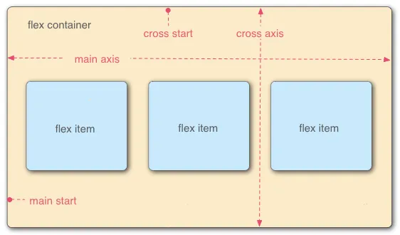
A "flex container" that holds a collection of "flex items" is the foundation of the flexbox layout. The arrangement of the items and their alignment along the main and cross axes can be managed by the container. The principal axis along which the items are arranged is called the main axis, and the cross axis is perpendicular to the main axis.
To create a flex container, you set the display property of the container to "flex" or "inline-flex." For example, to create a flex container with a class name of "container," you could use the following CSS:
You must set the container's display property to "flex" or "inline-flex" in order to construct a flex container. You could use the following CSS, to construct a flex container with the class name "container":
.container {
  display: flex;
}
Once the flex container is prepared, you can use several flexbox properties to regulate the arrangement and alignment of the flex elements within it.
Flexbox Properties:
Flexbox Container | Parent
1. Display
The display attribute is used in the context of flexbox to define the container element as a flex container, which allows its child elements to become flex items. By default, the items are laid out along the main axis.
.container {
   display: flex | inline-flex;
}
The
display: flexspecifies that an element should be displayed as a flex container.The
display: inline-flexspecifies that an element should be displayed as an inline-level flex container.
When an element is set to display as a flex or inline flex container, its child elements become flex items, and the element becomes the flex container for those items.
flex-direction: This property sets the direction of the main axis. It can be set to "row" (the default), "row-reverse", "column", or "column-reverse".
2.Flex Direction
flex-direction: This property sets the direction of the main axis. It can be set to "row" (the default), "row-reverse", "column", or "column-reverse".
.container {
   flex-direction: row | row-reverse | column | column-reverse;
}
3.Flex Wrap
flex-wrap: This property controls whether flex items should wrap onto multiple lines or not. It can be set to "nowrap" (the default), "wrap", or "wrap-reverse".
.container {
   flex-wrap: nowrap | wrap | wrap-reverse;
}
4.Flex Flow
flex-flow: property is a shorthand property in CSS that allows you to set both the flex-direction and flex-wrap properties in a single line. This makes it easy to control the direction and flow of flex items within a flex container.
.flex-container {
    flex-flow: <flex-direction> <flex-wrap>;
}
5.Justify Content
justify-content: This property sets the alignment of items along the main axis. It can be set to "flex-start" (the default), "flex-end", "center", "space-between", "space-around", or "space-evenly".
.container {
   justify-content: flex-start | flex-end | center | space-between | space-around | space-evenly | stretch;
}
6.Align Items
align-items: This property is used to control the vertical alignment of flex items within a flex container along the cross-axis (which is perpendicular to the main axis). It defines how the flex items are aligned within the container when they don't take up all the available space on the cross-axis.
.container {
   align-items: flex-start | flex-end | center | baseline | stretch;
}
7.Align Content
align-content: property is used to control the spacing between multiple lines of flex items within a flex container along the cross-axis. which happens when the flex-wrap property is set to wrap or wrap-reverse.
.container {
   align-content: flex-start | flex-end | center | space-between | space-around | space-evenly | stretch;
}
8.Gap
gap: property in flexbox is used to define the spacing between flex items within a flex container. It is a shorthand property for setting both the row-gap and column-gap properties, which define the spacing between rows and columns of flex items respectively.
.container {
    row-gap: 30px;
    column-gap: 20px;
    /* gap: <row-gap> <coloumn-gap> */
    gap: 30px 20px;
 }
Flexbox item | Child
1.Order
order: This property sets the order of the flex item within the flex container. It takes an integer value, with the default value being 0. Flex items with a lower order value appear first in the container.
.item {
   order: 3;
}
2.Flex Grow
flex-grow: This property specifies how much the flex item can grow to fill available space within the flex container. It takes a unitless value, with the default value being 0. Flex items with a higher flex-grow value will grow more than those with a lower value.
.item {
   flex-grow: 3;
}
3.Flex Shrink
flex-shrink: This property specifies how much the flex item can shrink if the container is too small to accommodate all the items. It takes a unitless value, with the default value being 1. Flex items with a higher flex-shrink value will shrink more than those with a lower value.
.item {
   flex-shrink: 3;
}
4.Flex Basis
flex-basis: This property specifies the initial size of a flex item before any remaining space is distributed. It can be expressed as a length value (e.g., "100px"), a percentage value (e.g., "50%"), or the keyword "auto" (which means the item's size is based on its content).
.item {
   flex-basis: 100px | auto | content;
}
5.Flex
flex: This shorthand property allows you to set the flex-grow, flex-shrink, and flex-basis properties all at once. It takes three values, in the order of flex-grow, flex-shrink and, separated by spaces.
.item {
   /* flex:  <flex-grow> <flex-shrink> <flex-basis>; */
   flex:  1 1 auto;
}
6.Align Self
align-self: This property allows you to override the default alignment of a flex item along the cross-axis (i.e., the axis perpendicular to the main axis of the flex container). It can take the same values as the align-items property on the flex container, such as "center", "flex-start", "flex-end", "stretch", or "baseline".
.item {
   align-self: flex-start | flex-end | center | baseline | stretch;
}
By mastering the Flexbox layout in CSS, you can create stunning and responsive designs that bring your web projects to life.


